Caution Signs in Safety Signs


About Caution Signs in Safety Signs - Walmart.com
Caution signs help you mark spills, work zones, and restricted areas with clear, fast visibility. You can compare materials, mounting styles, language options, and message types to match your facility.
When you need clear direction, you should choose signs built for your floor plan and traffic flow. You can use folding stands for temporary hazards and mounted signs for fixed reminders.
Choosing the right caution signs for your space
You should start with placement, because indoor and outdoor areas need different materials. You can use plastic or corrugated plastic where you need lightweight handling and simple repositioning.
If your sign stays outside, you should look for aluminum or weather-ready vinyl options. You’ll get a surface that handles sun, rain, and repeated exposure more smoothly.
You should also compare temporary versus permanent placement before you choose a format. You can carry A-frame floor caution signs between hallways, while wall mount styles stay visible in one spot.
- You can mark wet areas quickly with folding floor stands.
- You can post fixed reminders with wall mount or adhesive styles.
- You can improve readability with yellow caution signs in busy spaces.
- You can support mixed-language teams with bilingual caution signs.
You may also want hanging signs where doors, chains, or barriers guide traffic. You can use adhesive signs on smooth surfaces when you need a low-profile warning.
How to compare wet floor signs and other message types
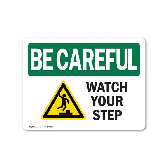
You should match the message to the exact hazard, because general wording can slow recognition. You can choose wet floor signs for spills, watch your step signs for elevation changes, and no entry signs for blocked areas.
If your team moves between tasks, you should keep several message types available. You can switch from under construction notices to floor caution signs as conditions change during the day.
You should also check whether the text and symbols support compliance standards in your setting. You can look for OSHA and ANSI aligned formats when your workplace requires familiar wording and recognizable layouts.
When you compare layouts, you should favor simple wording and bold contrast first. You’ll notice that large text and direct icons are easier to spot across open floors.
Choosing material, visibility, and language options
You should compare material weight and stiffness before you choose a sign for daily use. You can carry plastic caution signs easily, while aluminum styles suit longer placement on walls or posts.
If you need short-term direction, you should consider corrugated plastic for lightweight handling. You can also use vinyl decals when your message belongs on a door, window, or smooth panel.
You should think about visibility at different times of day before you decide. You can use high-visibility yellow, fluorescent color, or reflective surfaces where motion and low light affect noticeability.
When your facility has long corridors or dim entries, you should check reflective details closely. You’ll get stronger line-of-sight recognition in garages, loading areas, and evening setups.
You should also choose language that matches the people using the space every day. You can select English signs for simple posting or bilingual caution signs where teams and visitors read different languages.
How mounting type affects storage and daily use
You should compare portability if your hazards appear and disappear throughout the day. You can fold A-frame stands flat, carry them between tasks, and store them in a janitorial closet.
If your warning stays in one place, you should consider wall mount or adhesive formats. You can keep a consistent message near stairs, entrances, or equipment zones without moving parts.
You may prefer hanging signs when you need visibility above floor level or across an opening. You can place them where carts, boxes, or crowds might block lower signage.
You should also measure the viewing distance before you choose sign size and placement. You can improve clarity when the message appears at eye level or along common walking paths.
Using caution signs in real facility scenarios
You can use wet floor signs in schools, offices, stores, and healthcare waiting areas after routine cleaning. You’ll keep temporary hazards clearly marked while staff finish mopping or spot cleaning.
In warehouses and back rooms, you should choose durable floor caution signs with strong color contrast. You can guide forklift traffic, mark work zones, and separate active tasks from walkways.
If your building serves varied teams or guests, you should consider bilingual caution signs near entrances and shared spaces. You can reduce confusion where clear direction matters during busy hours.
For parking structures, docks, or exterior walkways, you should compare weather-ready materials and reflective finishes. You can maintain visibility where changing light and outdoor exposure affect readability.
You should feel confident when your signs match the location, message, and mounting need. You’ll get clearer communication, smoother traffic flow, and signage that fits daily facility routines.