

Open Neon Signs in Neon Signs











About Open Neon Signs in Neon Signs - Walmart.com
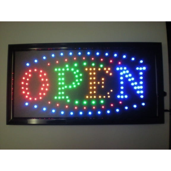
An open sign makes your storefront feel active, welcoming, and easy to spot. Open neon signs and LED open signs help customers notice you from the sidewalk or parking lot.
Many styles are made for window placement, so your message stays visible without taking up counter space. Whether you run a café, salon, studio, or pop-up, the glow adds personality and signals walk-ins.
Choose looks that match your brand, from classic red and blue tubing styles to modern edge-lit designs. Pick sizes that fit your glass area and finishes that complement your interior lighting.
On Walmart.com, it’s simple to compare formats, power options, and mounting choices in one place. That helps you match the sign to your hours, layout, and daily setup.
Why an open sign boosts storefront visibility
Open signage works because it’s readable at a glance, even from a moving car. Bright outlines and high-contrast lettering stand out against daylight, streetlights, and interior fixtures.
For many shops, an open neon sign also doubles as décor for the front window. That glow can help your entrance feel intentional and ready for service.
LED open signs are popular for consistent brightness and a crisp look. Many use lightweight acrylic panels or frames that hang neatly.
That makes setup simpler when you’re refreshing a display or rearranging seasonal décor. A lightweight build also supports repositioning when you change window layouts.
- Signals “ready for business” clearly during busy service hours.
- Adds a branded glow that complements menu boards, shelves, or reception desks.
- Helps walk-by traffic notice entrances set back from the street or behind glass doors.
- Creates a photo-friendly backdrop for boutiques, studios, and counter-service spots.
What to look for in neon open signs for business
Start by choosing between classic neon-style tubing and modern LED designs. Many “neon” looks use LED flex in a tube for a similar visual effect.
Traditional glass neon styles are less common, but some shoppers still prefer that signature look. If you want that style, confirm materials and handling details in the listing.
Check the sign’s dimensions and viewing angle before you decide. Wider lettering and bold borders read more clearly from farther away.
If your window sits high, look for designs that stay legible when viewed from below. If your glass is tinted, higher-contrast colors can help the message stand out.
Power details matter for a clean setup on a busy counter or window frame. Compare cord length, plug type, and whether the sign uses an inline switch.
If you plan to route cords along a frame, longer cords can simplify placement. Some setups also work well with a smart plug or timer you already use.
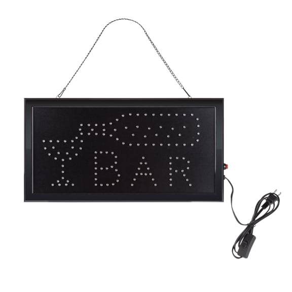
Mounting options are another key filter for daily use. Some open signs include chains, hooks, or suction cups for glass mounting.
Others use wall hardware, stand bases, or hanging kits for interior placement. Match the mount style to your surface and the look you want in the window.
Confirm lighting color and effects before you commit to a design. Some signs use single-color tubes, while others include multi-color modes.
If you want consistent branding, match the glow to your logo colors. A steady color can also photograph cleanly for social posts and menus.
Bright LED open signs for storefronts
If you want a clean, modern look, a led open sign can deliver sharp edges and even illumination. Many models are light enough for windows, making them practical for daily use.
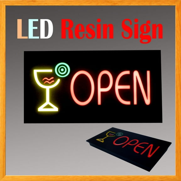
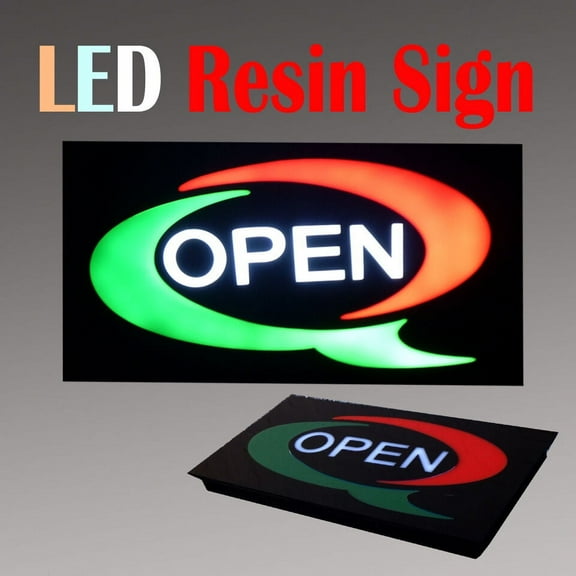
Some designs use acrylic panels that keep lettering crisp and easy to read. Others use flexible tubing mounted to a backing for a classic neon-style outline.
Think about where the sign will live during open hours. Window placement faces foot traffic, while interior placement can guide customers to the counter.
For corner locations, consider a design that stays readable from multiple directions. A centered layout and bold border can help from angled views.
For longer operating hours, consistent brightness helps your message stay clear. Look for clear product specs on power source and any included adapters.
If you use timers or smart plugs, standard plug-in designs can fit into your routine. Check where the switch sits, so it’s easy to reach.
Everyday use cases for an open neon sign
Restaurants and cafés often place an open neon sign near the door by hours decals. The glow helps first-time visitors spot the entrance quickly.
Pairing it with warm interior lighting can keep the front window inviting. A sign that faces the street can support quick recognition during busy periods.
Salons, barber shops, and spas use open signs to signal walk-in availability. A consistent light looks polished against mirrors and product shelving.
Many owners choose smaller signs that fit between posters and service lists. That keeps the window tidy while keeping the message visible.
Retailers use neon open signs to anchor window displays with featured items. It can frame a display and add contrast without extra clutter.
For boutiques, the sign can also create a recognizable photo spot. That’s useful when your storefront relies on visual merchandising.
Studios and service businesses often use open signs at reception areas. The light clarifies when the front desk is staffed during appointments.
In shared buildings, a bright window sign can help visitors find the right suite. It also supports wayfinding when exterior signage is limited.
Event booths and pop-ups benefit from lightweight LED options. Hanging a sign behind your table makes your space easier to spot in a busy room.
It also sets a clear vibe for markets, fairs, and seasonal setups. When your booth moves, a lighter sign supports quick resets.
Pick the right size and placement for your open signs
Measure your window area before choosing a design and mounting style. Leave space around the sign so the lettering stays readable.
A sign placed too close to posters or decals can lose contrast. A clear border around the message helps it read from the street.
Decide whether you want the sign centered, offset, or layered into a display. Center placement reads cleanly, while offset placement balances logos and decals.
Layered placement can work when you’ve got shelves or props in the window. Keep the message unobstructed from common viewing angles.
Plan for cable routing and visibility before you hang the sign. Place it where cords can run along edges or behind trim for a neat look.
A tidy setup keeps the focus on the message, not the hardware. That matters when customers scan your window in seconds.
Your open sign should look intentional, not temporary. When size, brightness, and mounting match your space, your window reads clearly.
That means steadier walk-ins and a strong first impression during open hours. A clear glow helps your storefront communicate fast.